NIEHS Superfund Research Program (SRP) grantees and in-house scientists are lending their expertise in data integration and online tool development to explore how COVID-19 spreads and why some communities experience higher risk of infection. The projects described below represent just some of the diverse research underway at SRP centers during the COVID-19 pandemic.
Collaborative effort describes COVID-19 risk
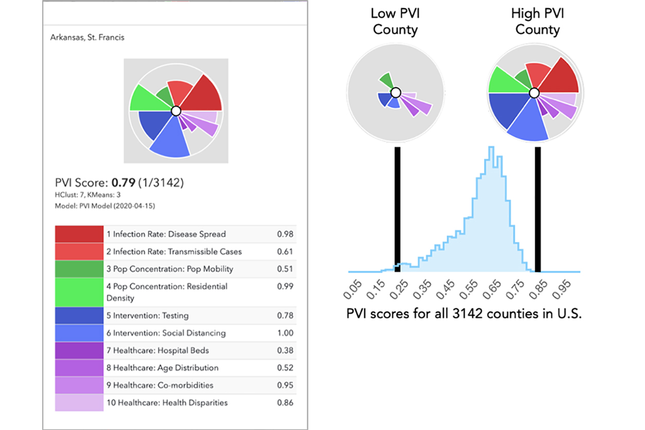
Alison Motsinger-Reif, Ph.D., head of the NIEHS Biostatistics and Computational Biology Branch, collaborated with a team of researchers from North Carolina State University and the Texas A&M University SRP Center to develop the COVID-19 Pandemic Vulnerability Index (PVI). The innovative PVI dashboard, which is continuously updated with new data, communicates COVID-19 data and identifies areas especially vulnerable to the disease.
The dashboard portrays risk profiles, called PVI scorecards, for every county in the United States. The scorecard summarizes and visualizes overall risk using a pie chart, in which different vulnerability factors are shown as separate pieces of the pie. Estimates of infection rates, testing rates, population density, social distancing interventions, age distribution, and other health and environmental factors are represented.
“The main limitation of most of the online maps currently available is that they are looking in the rear-view mirror, especially due to the long incubation period of COVID-19,” said team member and Texas A&M University SRP Center researcher Weihsueh Chiu, Ph.D. “The vulnerability index [will] identify potential future hot spots and, thus, help decision-makers initiate, intensify, or relax interventions as appropriate.”
COVID-19 vulnerability in Massachusetts
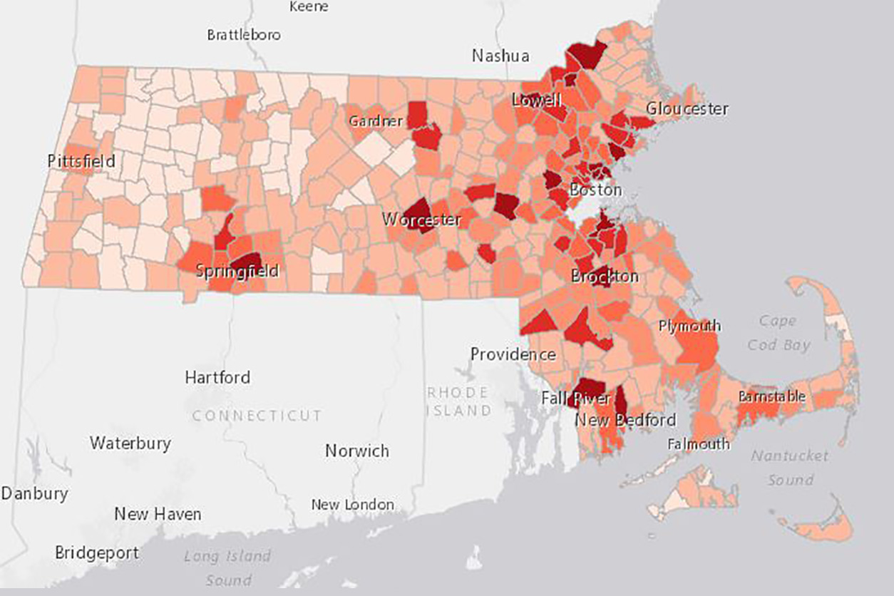
Boston University SRP Center researchers Jonathan Levy, Sc.D., Patricia Fabian, Sc.D., and Madeleine Scammell, D.Sc., collaborated with the Massachusetts Attorney General’s office. For the 38 major cities and towns in Massachusetts, their project does the following:
- Presents daily COVID-19 case counts.
- Assesses racial and ethnic disparities.
- Examines vulnerability factors associated with the outbreak.
Using publicly available data and resources from the university’s Center for Research on Environmental and Social Stressors in Housing Across the Life Course, the team created the mapping tool and continues to update and expand it. As part of their data analysis, the researchers identified and reported other health, economic, social, and environmental factors that may increase vulnerability.
Maps describe how each type of vulnerability pertains to likelihood of COVID-19 infection and symptom severity. Vulnerabilities include chronic conditions, economic vulnerabilities, challenges with physical isolation, and environmental stressors, such as air pollution.
Mining data to fight the virus
University of California, San Diego SRP Center grantee Ilya Zaslavsky, Ph.D., is part of a team integrating biomedical and environmental datasets to learn more about the characteristics and spread of COVID-19. The researchers and their colleagues are building a knowledge graph to show how different strains of SARS-CoV-2 spread through communities.
“The goal of the project is to link various datasets to understand the interplay between host, pathogen, and the environment in the context of the COVID-19 pandemic,” said Zaslavsky. “This is part of our work to develop a search engine, Knowledge Open Network and Queries for Research (KONQUER), to converge biomedical and environmental data registries and a number of computational tools. This will help researchers obtain and integrate relevant datasets from multiple scientific fields.”
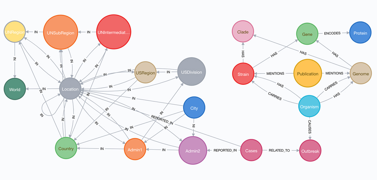
The left side of the preliminary knowledge graph model shows the location hierarchy from world to city levels. Geolocations are linked by COVID-19 case counts to information about host organisms, virus strains, genomes, genes, and proteins, and publications that mention the virus strains. (Image courtesy of Peter Rose, UC San Diego)
With additional support from a National Science Foundation RAPID award, the team is developing tools that use public health, pathogen, and environmental datasets and models. Online dashboards will help users access and query the graph.
The team also launched an online community data sharing effort, through which people can suggest publicly accessible datasets to include in the graph, contribute applications to enhance graph content, and add knowledge graph analysis and query tools.
(Sara Amolegbe is a research and communication specialist for MDB Inc., a contractor for the NIEHS Superfund Research Program.)
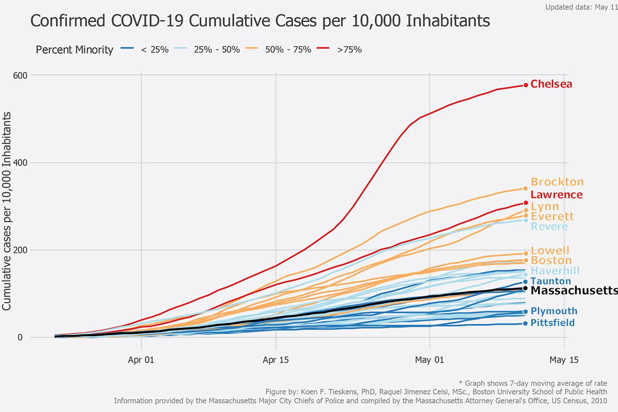
In one visualization on the website, the researchers show how the number of cumulative cases per 10,000 inhabitants in Massachusetts is generally higher in cities with higher minority populations (red and gold) compared with lower percent minority cities (blue). (Image courtesy of Boston University)


