The Pandemic Vulnerability Index (PVI) dashboard, developed by scientists at NIEHS, North Carolina State University, and Texas A&M University, has now been added to the COVID Data Tracker resources curated on the U.S. Centers for Disease Control and Prevention website. Public health authorities, state authorities, and others can view real-time analysis of county-by-county data as they allocate resources and update responses to the ongoing coronavirus pandemic.
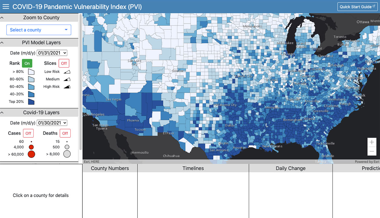
Users of the PVI dashboard can zoom in and select a county to see real-time estimates of COVID-19 risk based on 12 factors, both static and dynamic. (Image courtesy of NIEHS)
Alison Motsinger Reif, Ph.D., head of the NIEHS Biostatistics and Computational Biology Branch, is corresponding author on an article about the PVI dashboard published Jan. 5 in the NIEHS-affiliated journal Environmental Health Perspectives(https://ehp.niehs.nih.gov/doi/10.1289/EHP8690) (EHP).
Motsinger-Reif and her coauthors wrote that they developed the PVI dashboard to support responsive community-level decision making. The tool presents “a visual synthesis of dynamic information at the county level to monitor disease trajectories, communicate local vulnerabilities, forecast key outcomes, and guide informed responses,” according to the article. The PVI dashboard first became available to the public in the spring of 2020.
Visualizing vulnerabilities
 Motsinger-Reif came to NIEHS in 2018, where she leads a team that develops methodologies and new applications of existing techniques for environmental health research. (Photo courtesy of Steve McCaw / NIEHS)
The dashboard is also accessible from the NIEHS website(https://covid19pvi.niehs.nih.gov/). Data on 12 risk factors that influence pandemic severity are pulled from various sources and displayed in a type of pie chart called a radar chart.
Each risk factor is displayed as a separate slice of the pie, sized to convey its contribution to overall pandemic risk. Risk factors include infection rates, testing rates, social distancing interventions, population characteristics, and other health and environmental factors. New factors, such as testing positivity rate, may be added from time to time.
The risk profiles, called PVI scorecards, are available for every county in the United States.
PVI developers designed the tool to clarify and communicate large, complex data to both decision makers and the public. The goal is to help planners identify growing hot spots so they can take appropriate action, incorporating important measures of population-specific vulnerability.
Real-time data
As agencies update the data sources that the dashboard pulls from, the radar charts in the tool update automatically. Current data, filters, and other features that allow tailoring of the display makes the PVI dashboard useful to support decision making and monitoring. For example, public health agencies can track the impact of interventions and use it in planning vaccine distribution and monitoring effectiveness. Or an organization may consult PVI scorecards to select counties for evaluating testing-based intervention strategies.
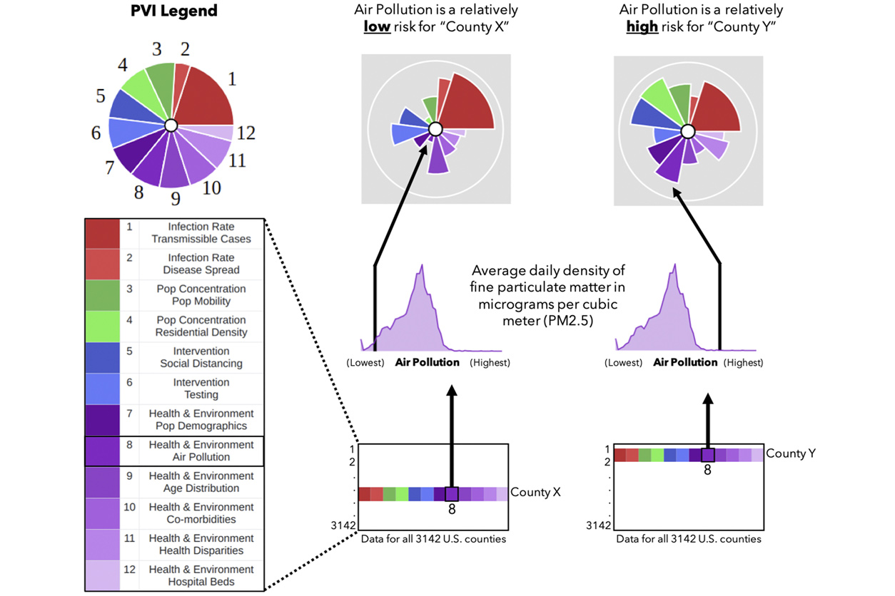 The size of each factor’s segment reflects the extent of its contribution to overall risk. Air pollution plays a much smaller role in County X compared with County Y. Note: “pop” is population. (Image courtesy of Marvel et al., 2021, Environ Health Perspect 129(1):17701)
 “By communicating an integrated concept of vulnerability that considers both dynamic and static drivers, the interactive dashboard can promote buy-in from diverse audiences, which is necessary for effective public health interventions,” wrote the authors. Dynamic risk factors include infection and hospitalizations. Factors that change much more slowly, such as county population characteristics and health care options, are considered static.
Target disparities
Looking at counties across the nation, the authors observed stark differences. “After population size, the most significant predictors [of pandemic vulnerability] were the proportion of Black residents, [concentration of] mean fine particulate matter, percentage of population with insurance coverage, and proportion of Hispanic residents,” they wrote.
The tool’s integration of static and dynamic factors can help policymakers address racial disparities in COVID-19 death and case rates. Users can filter the display to highlight certain drivers of vulnerability, thus making the dashboard useful for developing a targeted intervention in a specific location.
“Unfortunately, the pandemic endures across the United States, with broad disparities based on the local environment,” the authors wrote. “We present the PVI Dashboard as a dynamic container for contextualizing these disparities.”
Citation: Marvel SW, House JS, Wheeler M, Song K, Zhou YH, Wright FA, Chiu WA, Rusyn I, Motsinger-Reif A, Reif DM. 2021. The COVID-19 Pandemic Vulnerability Index (PVI) dashboard: monitoring county-level vulnerability using visualization, statistical modeling, and machine learning. Environ Health Perspect 129(1):17701.